Prototyping and building an easy-to-manage bilingual website for a children’s literacy organization
Discovery – Testing – Technical Acumen
The nonprofit East Durham Children’s Initiative came to us for a website redesign. They serve a lower-income population with many Spanish-speaking families. We knew our product would need to be bilingual, friendly to users with lower technical literacy, and easy for EDCI to manage content in both English and Spanish.
Challenge
Build a single website with bilingual content that is easy for an organization to maintain without a confusing, messy backend.
Solution
Prioritize information architecture and clear site navigation for users, and invest time in prototyping functionality of language toggle and the backend content management workflow.
The Process
Define & Prioritize Requirements
Instead of creating and maintaining two separate websites —one in English and one in Spanish— the client requested a single website that could toggle between the two languages. In addition to page body content, all menus, buttons and forms would need to be available in both languages.
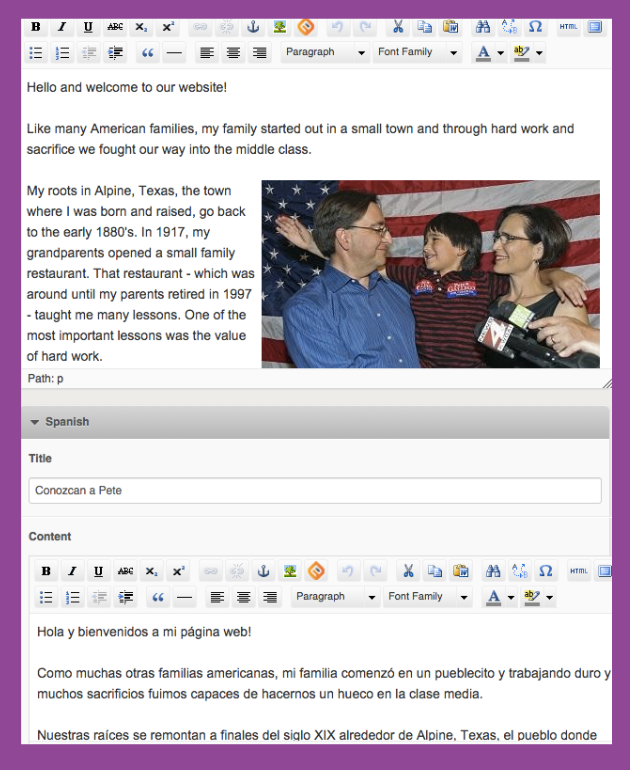
EDCI wanted to reinforce that they were a committed community partner and provided Spanish translations for most of their content. Further, they wanted the Spanish content to be original (written by staff members) and not use an automated translation tool; having Spanish content with correct grammar and clear, contextual writing reinforced their commitment to their Spanish-speaking community.
Information Architecture & Content Planning
Planning content and organizing the site IA, and locking it in early on, was critical for this project. The site’s content needs would help inform the approach we took to development. We worked with EDCI to think through current content needs as well as potential/future needs, so their investment with us could be iterated upon when needed.
Wireframing Key Content and Utilizing Templates
To help maintain consistency through site content, we identified core sets of pages and designed templates for each type. These wireframes and mockups were helpful tools in discussions about usability, as well as language needs for different elements on a page.
Additionally, to aid users with lower technical literacy, we included both breadcrumbs and sidebar submenus on every interior page.


Proof of Concept & Testing
I worked closely with a developer to outline two different approaches for site structure and content management that we would test:
Approach A
The site tree would have a single page for each topic. In the content editor, there would be one field for English content and one field for Spanish content.
Colleagues at our agency had used this approach with another project with bilingual content needs and shared this solution with us.
Approach B
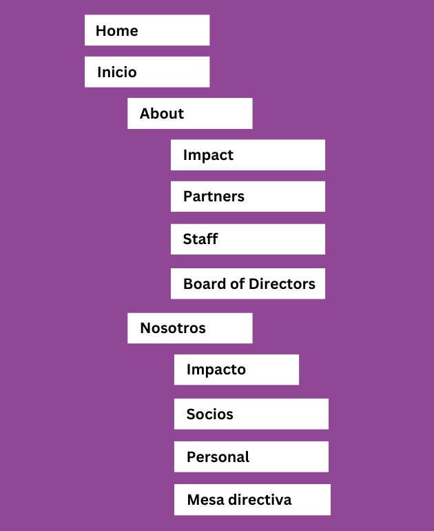
The site tree would have two pages for a single topic; one page in English and one page in Spanish.
The site tree would be sectioned by language and organized so each section’s structure would be mirrored in the other language.
During testing, we identified that Approach B (with ‘mirrored’ pages in the site tree) offered the best solution for development and tight control over translations of different page elements, such as buttons, headers and footers, and sidebar menus. We prototyped this solution with the client, who felt comfortable with the content mangemange workflow of this option.
For the small handful of pages that did not have translated content (no mirror page in site tree), the language toggle is not displayed for users on that specific page.
We used a custom proprietary CMS because of the flexibility it allowed us for customization and its user-friendly interface for the client.
Outcome
Our approach allowed the client the opportunity to customize copy in English and Spanish, so content would not be restricted to a direct 1-to-1 translation, like if using an automated translation tool.
Using the language toggle button kept users on the same page, and everything is translated: body content, menus, buttons, etc., allowing for a truly customized bilingual experience.
This feature allowed Spanish-speaking users to switch to their language at the start of their website experience, or allowed English-speaking users (teachers, social workers, etc.) to find content in their language and switch to Spanish to share with their student’s families